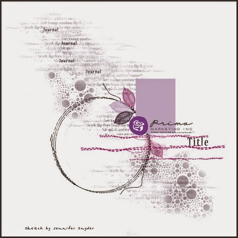
I am entering the contest for Prima Marketing Build-A-Page October 2014.
I took a few pictures while I was on the creative process and I am going to share with you how I do my layouts at the end of the post together with the material list used. Any question just write to TudoParaScrap@gmail.com
Cheers,
Djana
Checking my options...
I wanted to use the '&' as my title, so first I tried two stamped images to represent either twins or two sides of the same person...
But I wanted a more monochromatic page to challenge myself. For those that knows my artwork, I like color and do a subtle project is very challenging to me.
And of course I wanted to see how the colored imagine looked too.
Then I changed my mind to have two birds and the title be connected to the birds and not the girls.
Or it would be connected to both???
I tried to not finish my layouts the same day I start. I like to let the idea as settle down and then the next day I usually have my final decision.
Now some hands on work for the background.
Crackle Texture Paste applied:
Crackled Paste dried and active:


No comments:
Post a Comment